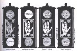
 New York City is known for its jaywalking. It may not be the jaywalking capitol of the world, but it has been know to have many jaywalking deaths. That situation inspired the city to install the first walk/don’t walk signs in history on February 5, 1952. Not every inspiration or invention brings change for the better, and I don’t think that all regulation is a good thing, but when it comes to a meeting between a car and a pedestrian, the pedestrian will lose every time. The use of these pedestrian traffic signs are still used today in order to make streets safer.
Walk/Don’t Walk signs are just a normal fixture these days. We use them at every busy intersection, and don’t give them a second thought…unless they seem to be taking too long to change. Then we feel annoyed, or even cross against the light, which is still jaywalking, even though we are at a crosswalk. While it isn’t uncommon to be annoyed at the wait to cross the street, it can be nice to have that assistance when there is a lot of traffic.
The walk/don’t walk signs have changed over the years, from the very basic style installed in New York City in 1952, to the more modern ones that tell you when to walk or to wait. These are of course designed with the visually impaired person in mind. Our society have become more aware of the needs of the handicapped, and the voice control feature is truly vital.
Strangely, the Walk/Don’t Walk sign has not always been an apostrophe in the word “don’t.” When the first don’t walk signs were installed in New York, they didn’t have an apostrophe between the letters n and t, which makes that the sign was written as ‘dont walk’. It is thought that these signs lack an apostrophe, because it made the stop command more urgent. Another theory about why the signs missed the apostrophe was because  they were made from a single-piece neon light, which made it difficult to add the apostrophe. I don’t suppose we will ever know why, for sure.
Between 1999 and 2000, it was decided that the traditional ‘walk’ and ‘don’t walk’ signs should be phased out, because they were difficult to understand for people who didn’t speak English. Many pedestrian accidents occurred with tourists in New York and therefore the city decided to change the traditional sign into a simple stick figure of a walking man when green, and a raised hand when red. Whichever type of walk/don’t walk signs you have in your town, you can be sure that the signs have saved lives.


4 Responses to Don’t Walk Signs